In the last "data to the people"-post I described the kind of basic analytics classes we conduct at Jimdo, which aim at empowering colleagues to query our data warehouse with basic SQL.
Additionally to this and the SQL Lean Coffee Session we conduct, we also provide more advanced SQL classes. In these advanced classes we look into joining tables and aggregate- and OLAP-functions.
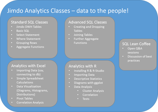
The next step in our efforts for data democratization is to run more advanced analytics classes which go beyond SQL. There will be one for colleagues more interested in advance analytics with Excel and another one which will aim at doing analytics with R. The below diagram summarizes the different analytics classes that are being offered at Jimdo.
Many might view Excel as the most anti data sciency tool to use for analytics but in my experience it is the most widely used data analytics tool and pretty damn powerful. I would even bet that the majority of profitable insights generated through data analytics come through some sort of Excel Analysis. People who laugh at others using Excel are probably the same that roll their eyes at data scientists using "traditional" SQL databases. I always found this kind of dogmatism unprofessional, why would someone voluntarily narrow his toolset for the sake of hipness?
This is why I love John Foreman's book "Data Smart". He explains many of today's standard machine learning algorithms using Excel and only at the end points towards doing analytics in R.
The Excel class will cover the basics of importing data into Excel, spreadsheet calculations, data visualizations. We'll also go into the powerful Pivot Tables and demonstrate how easy it is to view a specific data set from many different perspectives. Finally we'll also do some simple correlation analysis to dig into more advanced data analysis.
The analytics with R classes will be based on R-Studio since working with this R-GUI will probably make the adaption a lot easier. We'll cover how to import data and and produce first simple descriptives statistics.
Visualizing data with ggplot will be one of the main topics of this R class. We'll explain how to analyze and display data distributions with histograms, boxplots and probability density functions.
Understanding different types of correlation analysis and basic cluster analysis will allow participants to start analyzing relationships between variables. This will be round off by some simple Test Analysis.
The introduction to exploratory data analysis will include common pitfalls to watch for. There we'll be an emphasize on always visualizing relations between variables, for example with Scatterplots. Anscombe's Quartet (http://en.wikipedia.org/wiki/Anscombe's_quartet) will be introduced to demonstrate how misleading simple statistical properties can be and why visualization is important.
Most importantly we will stick to examples from our daily work. So we won't go into the theory concerning different clustering or correlation analysis algorithms but rather explain in the form of cook book recipes which methods are best suited for which use cases. We'll also only use real work examples instead of any type theoretical data. In my experience clean and well formatted demo data (e.g. the notorious iris data set) is ok to understand a specific method, but hides the pitfalls that one will encounter when working with messy real life data.
Further developments regarding these analytics classes could include predictive modelling, timeseries analysis or even developing recommender systems. But the short term goal is to get as many Jimdo colleagues as possible to do standard data analytics regularly. This way Jimdo will become truly data driven.


Write a comment
college entry essay (Thursday, 12 October 2017 06:36)
I can understood the data of this great article for sharing different parts. Then you will remember a lot about these all resources and essays. So I prefer your all content to make perfect services and essays.